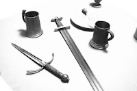
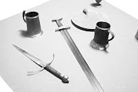
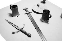
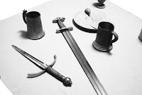
So I've been playing around with the idea of photographing some props I have and then doing some Photoshop processing on the pictures to provide some of the art for my RPG. I've done some sample picture-taking and ran a test photo through a number of different artistic filters. I'd like to get some feedback on the various styles I tried, and figured I'd post the photos here and see what people think. These photos are pretty big, so I'm keeping the thumbnails small - click on the image to see a more detailed version.
Here they are, in no particular order:
1. Color Pencil

2. Diffuse Glow
3. Paint Daubs
4. Palate Knife
5. Posterized
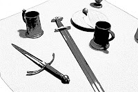
6. Smudge Stick
7. Watercolor

Thanks in advance for any comments or questions you have.


6 comments:
Once you shrink it down to smaller sizes, I like the colored pencil style the best.
I like palette knife or watercolor the best. Both those effects hide noise/grain from the photo well. And have a handmade feel.
Strange - looked at them a bit, headed over here, and found Anachronista picked exactly the same as me - palette knife is sharp enough so that it will look nice when shrunk, but watercolour makes it a little friendlier.
Polarised is good too.
I like the Palate Knife or the Smudge Stick.
Thanks for the great comments everyone. I did another photo shoot last night, and am in the process of making up some new test images. I'll probably post them tomorrow morning.
Wonderful snaps! Thanks for sharing such amazing photos here. Specially I like the palette knife. It is looking nice. Thanks for this nice post here. I enjoyed this blog.
Post a Comment